Typography is a powerful brand tool that plays a significant role in shaping and bringing consistency to the overall brand identity.
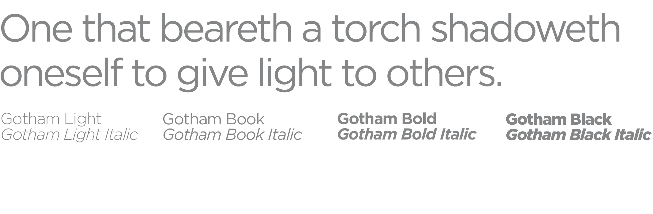
Primary Typeface
Gotham is the university’s primary typeface. It’s a clean and modern sans-serif typeface that works well for display copy, body text, and everything in between.
Longform Typeface
Georgia is an acceptable serif typeface for body copy in longform print publications such as magazines or annual reports. It may be used when the primary fonts are unavailable but should not be used for display copy.

Display Typefaces
A display font may be used when you need to create a mood or set the tone of a piece. Typically used for typesetting larger than 14 points, a display font should be used only for headlines or graphics. It should be used sparingly and tastefully and should never be used as body text.
Website Fonts
Montserrat is used as the primary typeface for university websites. If Montserrat is not available, the following fonts are included within UT websites and HTML email templates.
Sans serif: Helvetica, Arial, Sans-serif
Serif: Georgia, Times, Times New Roman, Serif