The logo is the primary signifier of our brand identity.
It must be present on all internal and external communications from the university. Depending on the medium, message, and audience, you may choose to use the university logo or a unit logo.
In addition to our logos, unit logo shortcuts allow campus entities to informally communicate their name and affiliation with the university in some instances.
Logo files may only be created by the Office of Communications and Marketing. If you need access to a unit logo or have any questions about using logos, contact your college or unit’s communications office. If you have any other questions, contact the Office of Communications and Marketing.
University Logo
The university logo combines two elements: the Power T icon block and the wordmark. Together, these elements uniquely communicate both our tradition of excellence and our position as a dynamic public research university.
Centered (preferred)

Left Aligned

Right Aligned

Unit Logos
Some colleges and administrative offices may require that their subunits identify affiliation with their parent organization by using the parent organization’s unit logo. Logo unit lockups are available in the following configurations.
Centered Lockup (preferred)

Left Aligned Lockup

Right Aligned Lockup

Unit Logo Shortcuts

The shortcut quickly communicates the name of a college, department, center, institute, or administrative office and its affiliation with the university. Due to the informal nature of unit logo shortcuts, their usage is limited.
A unit shortcut may be used in print communications as long as a full unit logo is also present on the same publication in a different design space. For example, you may use your unit shortcut on the front of a brochure and a logo on the back. If the piece is for use on campus only, the full unit logo is not needed.
Social Media Icons, Avatars, and Images
Icons (or profile photos) are available to all academic and administrative units with official social media accounts.
Though it is not required, this version is the only option if you wish to include the Power T or any other logo element in your social media icon. You should not use your unit logo or unit logo shortcut as your social media icon.
These icons may only be used as social media profile images, icons, or avatars. They may not be used in any other electronic medium, in print, or on merchandise.
Using Logos
Color Variations
Logos are available in three color variations. They may not appear in any color other than what is listed below.
Standard (preferred)

Reversed on Dark

Reversed on Orange

Use on Merchandise
When designing merchandise, such as apparel and promotional items, you should use a logo in the standard color whenever possible. You must always use a licensed vendor to produce such items.
One-Color Logos
You may sometimes be limited to a one-color imprint on merchandise, due to budget constraints or product limitations. One-color logos may only be reproduced in Tennessee Orange or white on merchandise as follows:
- Tennessee Orange imprint on a white, gray, silver, or clear background
- White imprint on an orange background
Clear Space
Clear space is necessary to provide breathing room around the logo. This space, equivalent to at least the height or width of the icon block, must be kept clear of any other design element.


Minimum Size
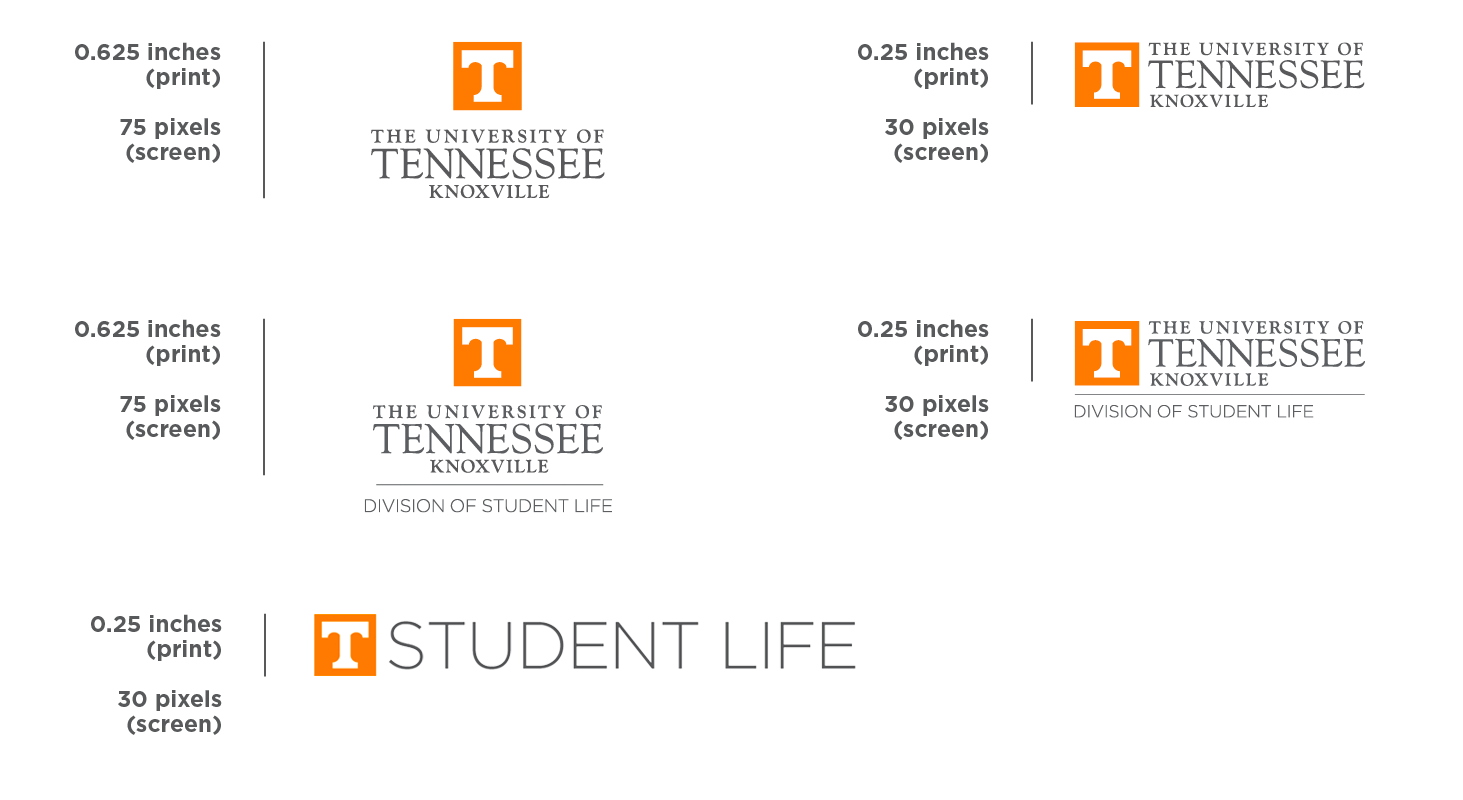
To ensure legibility, logos must not be reduced beyond the following defined minimum size.
The centered university logo should never be printed smaller than 0.625 inches tall. When displayed on screen, it should never appear smaller than 75 pixels tall.
Horizontal university logos should never be printed smaller than 0.25 inches tall. When displayed on screen, they should never appear smaller than 30 pixels tall.
The minimum size is defined by the height of the university logo, even when you are using the tagline logo or a unit logo. Layout or proportions of files may not be adjusted to meet this minimum size standard.
Multiple Logos
You may not use more than one university logo, unit logo, or unit shortcut in the same design space, such as on the same page of a print communication. You also may not combine multiple unit names into one logo.
If you need to identify more than one university entity equally on a communication, you should use one logo, preferably the university logo, and list multiple units as part of the content or within the design.
Download main university logo files
