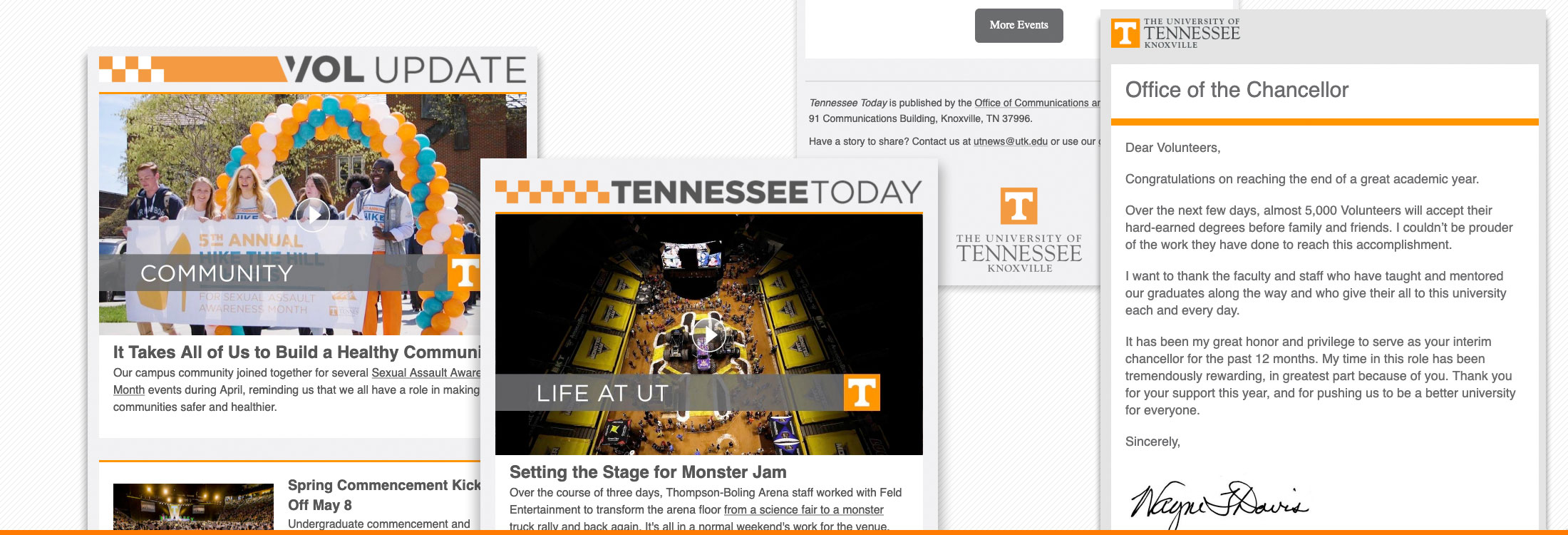
They’re a little old school, but well-crafted emails are still effective communications tools.

Academic and administrative units that send HTML emails to internal and external audiences should abide by brand standards, digital accessibility, and best practices for email design and delivery.
Best Practices
Visual Design and Layout
- Clearly identify it as an official UT communication.
Include your full departmental logo or the university’s logo at the top or bottom of your email. Follow the rules for logo usage. Don’t use your social media icon or shortcut logo. Limit yourself to one logo, and don’t use more than one Power T. - Make it readable.
Use a white (#FFFFFF) background for your content area.
Use Smokey gray (#4B4B4B) text for running copy and headlines. - Use the right image dimensions.
Full-width images should be no more or less than 600px wide. Set width=”100%” in HTML markup. - Give it a UT look.
Add Tennessee orange bars beneath your header image or before your footer. Select images with orange elements (T-shirts) or include decorative orange graphics (no text!) and content dividers to add UT personality.
Content
- Make it accessible.
Accessibility rules for web apply to HTML emails. Yes, that means no orange text on a white background or white text on an orange background. Yes, you have to include alt text for images. No, your entire email should not comprise a single image. Never place important information in an image. - Keep it short and sweet.
If you’re building a newsletter, use photos/graphics and brief, catchy text to drive traffic to content on your website. Resist the urge to put everything in your email. - Encourage interaction.
Include clear calls to action for readers to follow, but avoid phrases like “click here” and “learn more.” - Include your contact info.
Put your contact information somewhere in the body of the email. The footer (bottom) of the email is a very common place to find contact information.
Technical
- Know your limits.
Don’t try to send HTML emails from your desktop Outlook client. Also, forwarding HTML emails that you receive will break formatting. - Test your email.
There are a million email clients and screen sizes to design for: smartphones, desktops, tablets, Apple watches, Android, Apple, Mac, PC, Outlook Mail, Apple Mail, Gmail, O365, Yahoo!, etc. Email clients interpret code differently and display emails differently. Using a tool like an email campaign manager or an online email tester to see how your message will render in different environments can be helpful. - Check your links!
Always use absolute URLs (addresses that include the http:// or https://) to reference images in your email. - Always test or preview your email.
Make sure your links work and give it a final look for grammar and typos. - Don’t spam.
Only send to people who have agreed (either tacitly or explicitly) to receive your email. If you’re sending to an external audience, provide a clear way for your recipients to opt out of receiving future emails. - Provide a browser option.
Include a link to view the full email in a web browser. - Old school is still OK, but…
You can still use HTML tables to format emails. You can also code responsive emails using CSS and media queries (without tables) that adjust depending upon screen width. And yes, there is a hybrid approach. - Use a campaign manager.
Using an email campaign management system such as Emma, Campaign Monitor, MailChimp, and others to send your emails allows you to:- Gather data on opens and other audience interactions;
- Take advantage of preloaded or custom templates and GUIs to simplify the design process (i.e. you won’t have to learn how to write media queries!);
- Do A/B testing to determine the effectiveness of content like subject lines and placement of calls-to-action; and
- Better manage recipient lists so you can target specific content to audience segments and the like.