Link Hierarchy
The UT web design system offers a hierarchy of link styles so you can choose the right one for each context and level of emphasis. We like to describe these styles in terms of volume—quiet, medium, and loud!
Quiet
Text Links
This is the subtlest link style. Text links are for optional, supplementary actions a user might take, such as finding more information on a subject. Use text links within running copy to help users browse related topics (see what we did there?).
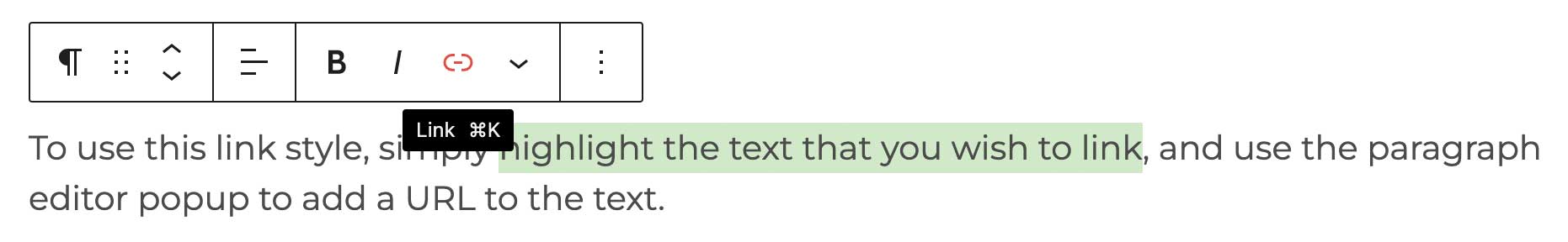
To employ this link style, simply highlight the text that you wish to link, and use the paragraph editor popup to add a URL to the selected text.
Medium
Single Link
When a link should stand apart from running text but doesn’t need to stand out too much, you can call on the single link. Use this link style for actions that are important but shouldn’t distract from other on-page elements, like promoting a new informational path at the end of a paragraph. There’s a small orange arrow to the left of the single link that moves slightly on hover. Limit link text to 30 characters or fewer to keep it looking “clickable.”
This link style is a custom WordPress block.
Link Group
The link group pattern collects links in either two or three responsive columns, and provides a means of grouping similar but distinct links. Users should be able to scan the link group text quickly and choose their next move with confidence. As with single links, there are small orange arrows to the left of each link that move slightly on hover, and each link includes a bottom border to keep things separated.
The link group is a WDS pattern, and you can find more information about it on its component page.
Loud
CTA Link
CTA is an acronym for “call to action,” so please use this pattern for calls to action only. A CTA is something you want a user to do (versus somewhere you want them to go). In the WDS, CTA links function as a supporting button, taking the user down a task-path that leads to an interaction (e.g., starting a process for applying, scheduling, signing up, etc.). These links are visually heavy, so limit your use of them to home, routing, and landing pages. Do not use more than two CTA links per page to protect the visual balance of the layout and the performance of your conversions.
The CTA link style is a custom WordPress block.
Button
Use buttons for the final step of direct actions or tasks the user can take, such as submitting a form, or as a control to let them change the state of the content on their screen (e.g., opening a modal). Keep button text short and “clickable,” 20 characters or fewer.
The button link style is a custom WordPress block.
Writing Good Links: Best Practices
Keep It Short
Studies show that website users read only about the first 11 characters of links and headlines when they scan a page. Front-load your link text so that the first part is the most important, and keep the text brief and to the point.
Be Descriptive
Use clear, descriptive link text to sets appropriate user expectations for what will happen when they choose to follow the link. Generic link text like “click here” or “learn more” are unhelpfully vague for all users and is an accessibility problem for users who navigate with a screen reader.
Tell Them What to Expect
Consequently, make sure the destination page or place for the link is a close match for what the link text is promising. If the connection is vague, users can feel confused or like they’re in the wrong place. It’s also a good idea to provide a warning if the link destination requires a login, is in a different file format (e.g. a pdf or other document), or is a different/external website.