A logo must be present on all communications from the university.
Depending on the medium, message, and audience, you may choose to use the university logo or a unit logo.
Some colleges and administrative offices may require that their subunits identify affiliation with their parent organization by using the parent organization’s unit logo.
Lockups
Logo unit lockups are available in the following configurations. They must be created by the Office of Communications and Marketing and may not be redesigned to appear otherwise.
Centered Lockup (preferred)

Left Aligned Lockup

Right Aligned Lockup
Color Variations
Logos are available in three color variations. They may not appear in any color other than what is listed below.
Standard (preferred)
Reversed on Dark

Reversed on Orange

Get Files For files, contact your logo liaison.
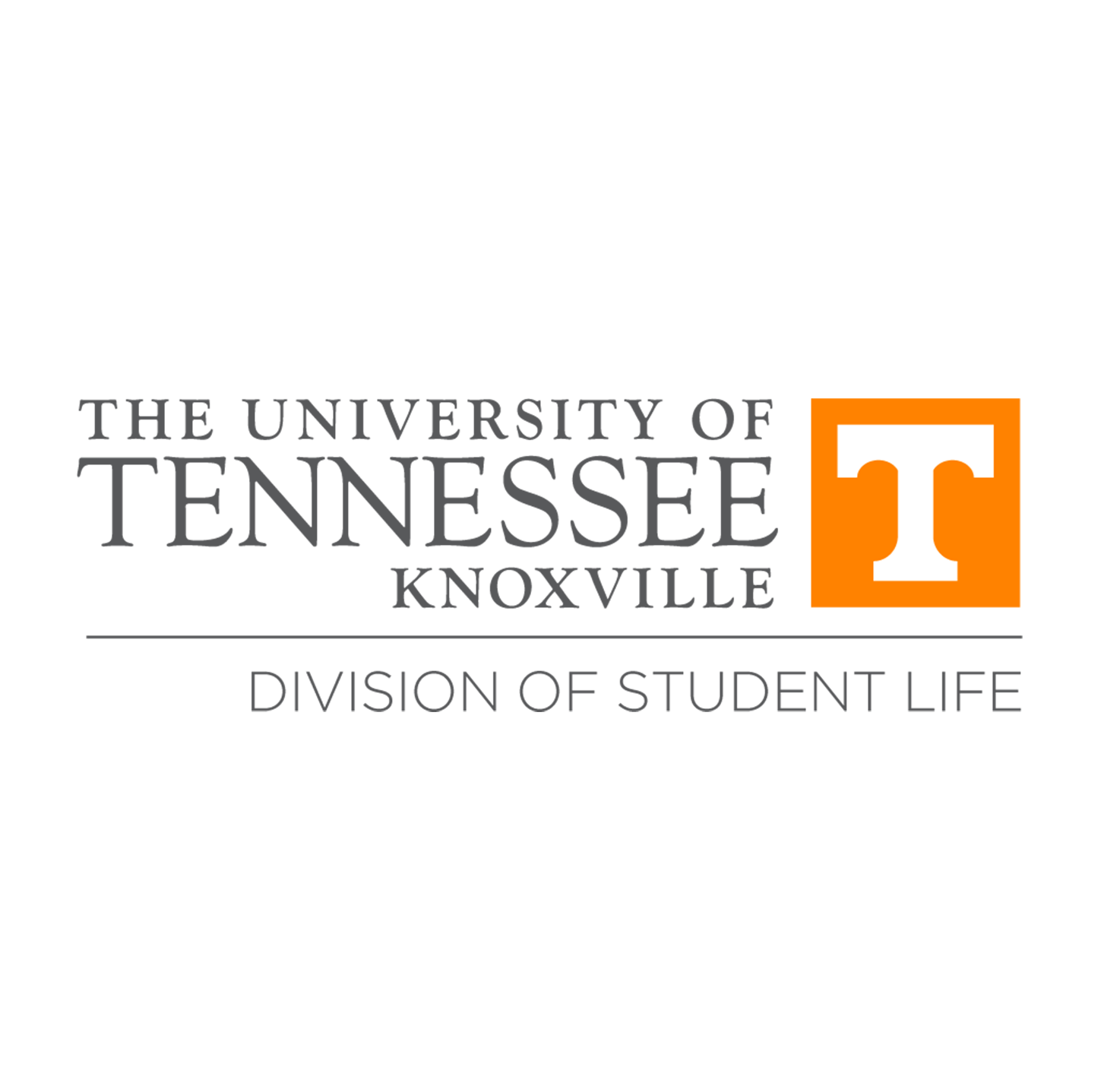
Using Unit Logos
Individual Elements
The elements of the logo should not be separated.
The wordmark should never stand alone.
The icon block is approved for standalone use in some digital instances designed by the Office of Communications and Marketing, including the website favicon, social media and mobile app icons, and as part of email and website templates. Otherwise, the icon block may appear only by itself with advance approval from the Office of Communications and Marketing.
The Power T should not be used by itself, separate from the icon block, by anyone except the Athletics Department. In rare and special circumstances, when the Power T icon needs to appear alone, the Office of Communications and Marketing will execute the design in close consultation with Athletics.
Clear Space
Clear space is necessary to provide breathing room around the logo. This space, equivalent to at least the height or width of the icon block, must be kept clear of any other design element.
![]()
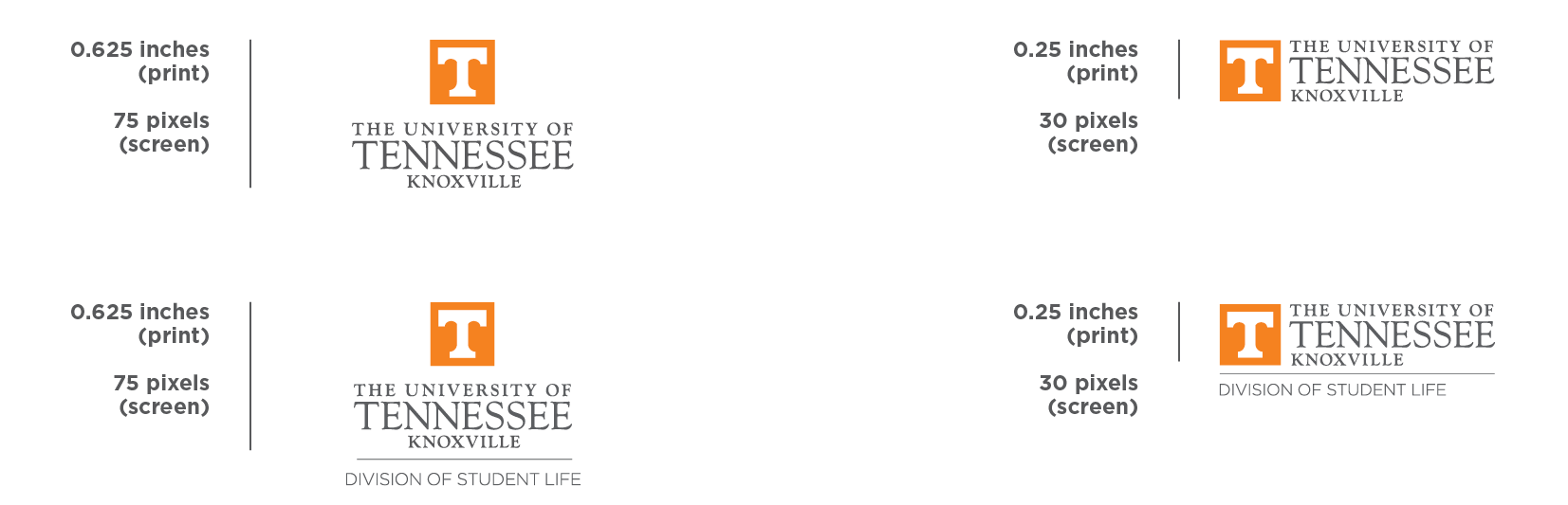
Minimum Size
To ensure legibility, logos must not be reduced beyond the following defined minimum size.
The centered university logo should never be printed smaller than 0.625 inches tall. When displayed on screen, it should never appear smaller than 75 pixels tall.
Horizontal university logos should never be printed smaller than 0.25 inches tall. When displayed on screen, they should never appear smaller than 30 pixels tall.
The minimum size is defined by the height of the university logo, even when you are using a unit logo. Layout or proportions of files may not be adjusted to meet this minimum size standard.
Multiple Logos
You may not use more than one university logo, unit logo, or unit shortcut in the same design space, such as on the same page of a print communication. You also may not combine multiple unit names into one logo.
If you need to identify more than one university entity equally on a communication, you should use one logo, preferably the university logo, and list multiple units as part of the content or within the design.
Get Files For files, contact your logo liaison.
Dos and Don’ts
Below are a few quick tips of what to do and not to do when using our logo.
Do
- Always include either the university logo or a unit logo in all university communications.
- Always use the files created by the Office of Communications and Marketing and provided to your unit’s logo liaison.
- Whenever possible, use the centered version of a logo in the standard color.
- Always adhere to the clear space and minimum size standards to ensure legibility.
- Contact your unit’s logo liaison or the Office of Communications and Marketing if you have any questions about using the logo or need additional guidance.
Don’t
- Don’t design a logo yourself. If you need files, your unit’s logo liaison will gladly provide them to you.
- Don’t alter your logo files. This includes stretching, squeezing, skewing, or otherwise distorting proportions or adjusting the layout or design.
- Don’t add anything, like words or images, to your logo.
- Don’t separate the elements of your logo.
- Don’t use the icon block or the Power T by itself, for example as a letter in a word or phrase.
- Don’t use more than one logo or unit shortcut in the same design space.
Get Files For files, contact your logo liaison.